Blog
Redesigning your on-site search for better ROI
With most online retail niches becoming increasingly competitive, it’s not surprising that more and more business owners are allocating more time and money to user experience and conversion rate optimisation (CRO), with a view to driving more value from existing customers. One area that is often considered as part of this activity is site search, which can add a lot of value in reducing the time to conversion and also making user journeys more streamlined. In this article we look at how redesigning your search box and function in general can drive more value from search.
Before looking at the specifics of how on-site search can be redesigned to follow best practice guidelines, it’s important to consider just how important it can be to the customer journey, and just what the potential gains might be. Research has proven over and over that those visitors who use on-site search have a higher purchasing intent than visitors who don’t use search, and that search-assisted visits convert at higher levels than other visits. As an example, eConsultancy looked at visitor stats for Suttons Seeds, a UK-based garden seeds retailer, and found that search-assisted visits represented just 15% of traffic to the site, but produced over 40% of the revenue generated through the site. This is relatively standard amongst our customers, which is why we often encourage front-end optimisation and making the search bar more prominent.
It’s worth noting that different types of stores are always going to have different approaches with search – for example merchants with larger, more complex catalogs are likely to want to really push search as the primary user journey, whereas smaller, boutique brands are far less likely to do so. We’ve provided the following tips based on our experience of working with retailers of all shapes and sizes and we’ve tried to include examples from lots of different types of stores.
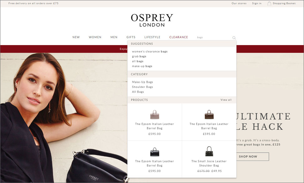
The above example shows how Osprey London use Klevu on their store – they have a relatively small and simple product catalog, but benefit from being able to boost / merchandise different products and collections.
It starts with the search box
It sounds so obvious, but the search box should occupy a prominent position that is clear and easy to spot, at the top of every page. The box should be big enough to type a query into, and should ideally contain a phrase that encourages users to search – ‘Enter product name, brand or other keywords’ for example. Of course, this phrase should disappear as soon as the visitor clicks into the search box.
All of that sounds fairly obvious, but it is surprising how many retailers don’t follow this basic principle. It’s not just smaller retailers who miss this opportunity either, as can be seen in the screenshot of Oliver Bonas’s website. Here, the retailer has chosen to remove the search box entirely, and only offers a magnifying glass, with just a reference to search. Considering the range of products they sell, I would say that they should be actively encouraging users to use the search box.
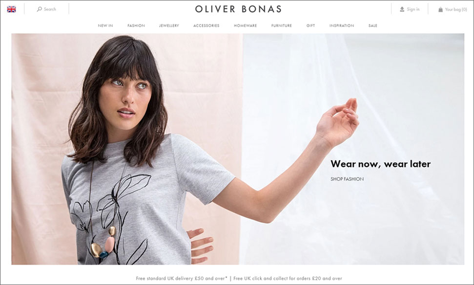
This might sit well with the overall design of the page, but it flies in the face of CRO best practice for on-site search.
A richer instant search experience
Another technique that can be really effective with on-site search is to use a smart search panel, displaying results once a search term has been entered into the search box. In eCommerce, every second counts when it comes to delivering results, so an instant search panel can speed up the customer journey and improve the overall experience.
The first part of a well-executed dropdown is to incorporate auto-suggest, to present the most likely results after the visitor has typed just a few characters from their intended search string. This gets the results to the visitor faster, but also helps avoid mis-spellings and brand or product name errors. If the on-site search engine is powered by a smart algorithm that utilises previous search data, the auto-suggest results should be incredibly accurate and should include the most likely products from within the store.
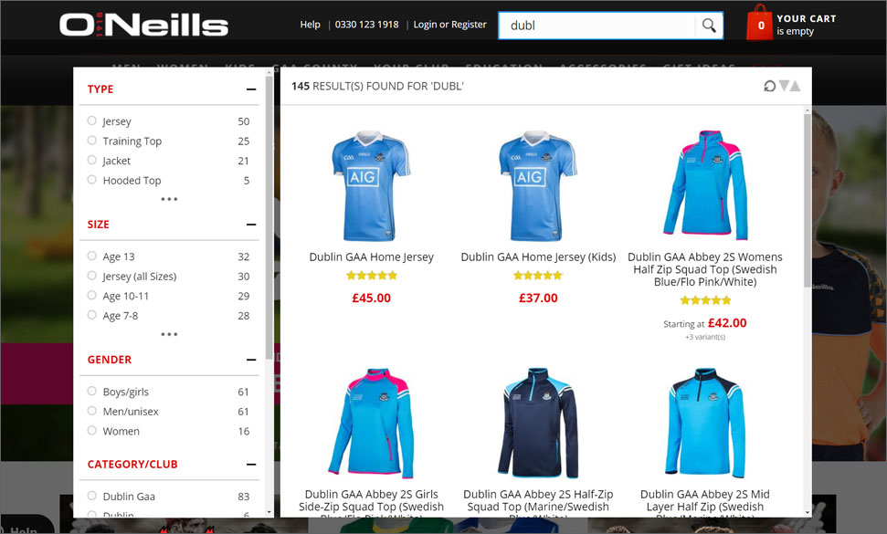
The next step for getting the most out of the on-site search dropdown is to offer fully merchandised items there. Products should include thumbnails, product names, prices and merchandising badges such as ‘Sale’, ‘25% off’ or ‘new in’. All of these help engage the visitor and encourage click-throughs to the product detail page, taking the customer one step closer to that all-important checkout.
The latest site search tools are also moving towards including non-product items in search results, in order to deliver the best possible results for each search query. Category results can be useful, along with CMS content such as returns and delivery pages, store locators, size guides and relevant blog content. By delivering the most accurate and informative content possible for each search query, the retailer is increasing the chances of a positive customer experience.
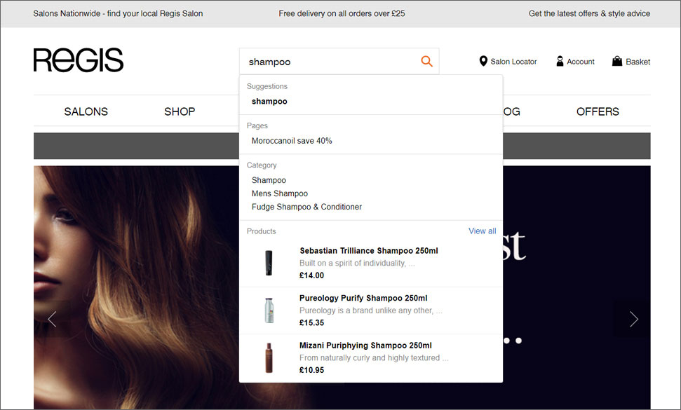
Whilst the ultimate goal is always to reach the sales conversion point, it’s important for retailers to recognise that some customer journeys are not at the purchasing stage, and to deliver content that reflects this. Ultimately, this will increase the chances of a successful purchase on a subsequent visit.
Optimised search results
Whilst the search box stage is incredibly important in the customer journey, the actual search results page represents a ‘make or break’ step towards conversion. A poor results page that presents a seemingly random assortment of irrelevant products, with few options to sort or filter them, is likely to lead quickly to abandonment, as visitors leave to go somewhere that can deliver more relevant results. There are a few key elements to a well-designed search results page, including options for layout, sorting and filtering of results.
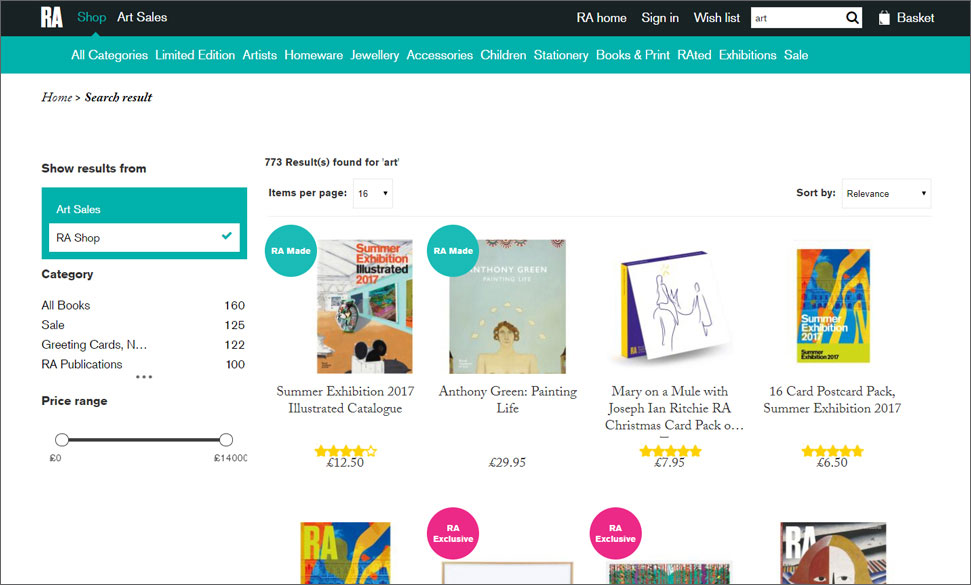
In terms of layout, results should be displayed with bold thumbnails, and easy to read product names, prices and configurable options such as size or colour, if possible. A ‘quick view’ option is desirable, as again, this speeds up the customer journey, allowing them to see detailed information about the item without waiting for a page load. Additional product images could also be available, to give the customer as much information as possible.
It’s essential that the optimal products are displayed at the top of the results page, so the ability for store owners to order products in search results, and weight specific items or categories, is crucial. It’s also important that any merchandising badges applicable to any particular product are displayed, and that those products are emphasised in the results.
Whilst customers value speed in their ecommerce experiences, they also like choice. It’s important therefore to provide options for filtering of results, as well as for sorting and display or results. Faceted search is now well-established as a tool for enabling customers to refine their search down to a smaller number of results, and this should be clear and easy to use.
Some smart search tools are able to show results with certain filters pre-selected. For example, a search for ‘red shoes’ might take the visitor to the shoes category, with the colour filter already set to ‘red’. More advanced options for filters could include customer ratings, which could have a positive impact on sales volumes. In terms of sorting and display, customers should be able to switch between grid and list views, and to sort by price, product name and customer ratings, if possible.
Implementing improvements
Existing search tools can be limited in terms of what amendments they can accommodate, and even with the most determined project team in the world, a search tool with poorly performing technology behind it cannot achieve the same levels of results as the latest best-of-breed search solutions. That’s why more and more retailers are taking their analysis of on-site search and using it as a catalyst to replace their current search tool altogether, most commonly the native technology within an eCommerce platform.
Some of the third-party search apps currently available use natural language processing (NLP) to drive their results – which is one of the key selling points of Klevu. NLP uses a semantic, context-driven algorithm to find results that are accurate and highly relevant to the visitor’s search. Klevu also provides self-learning technology, which allows your search to become smarter over time, as we analyse and aggregate search data to understand complex queries, including synonyms, language variants and even sizes.
It’s a big move to move away from the native search tool within an eCommerce platform, and to replace it with something entirely new. For more and more retailers, however, this choice is becoming a reality, and one that is delivering rewards immediately after launch.
If you would like more information about Klevu or would like to arrange a free trial, please get in touch with our sales team.


